One of the most common things I hear from founders is:
We have been launching features that have no impact. They just fail, and we don’t know why.
This is something referred to as a feature factory, which Marty Cagan has covered in his book.
Here, teams continuously busy themselves launching features that usually end up having no impact on core product metrics.
One way to prevent this is to test assumptions before building anything. When we think of a “good” idea, we silently assume that we are silently assuming. And test whether these things are really true to make this idea less risky.
However, for various reasons, user research can be tricky. One of them is response rates, which is getting people to give you feedback. For example, the average response rate for all surveys is 5-30%.
The key question to answer is how to ensure that questions get answered? How do you engage lower intent audiences who don’t want to talk to you or fill out long forms?
Enter: a one-question survey.
I first learned about this from Teresa Torres, a product discovery coach and author of Continuous Discovery Habits. Last year, I took her Hypothesis Testing course and loved it (highly recommend her books and courses).
I learned that a one-question survey is used to test assumptions. The benefit is that they are simple and used in the user experience. These two things lead to a higher response rate than email surveys (like this).
They also launch quickly and gather data fast (if placed in the right spot). With these higher response rates, you can get a lot of replies in a short time.
Other common one-question surveys include: exit surveys, where did you hear about us (WDYHAU), net promoter score (NPS) surveys, brand awareness surveys, and employee pulse surveys.
There are some key rules about one-question surveys that can help improve response rates and get accurate feedback:
- The question must be very simple (if someone needs to read it twice, that’s bad)
- They ask about actual behavior or opinions (no “can you” or “would you” statements)
- Ideally, they need to be embedded in the user experience (if you ask in a place that’s too far away, you might affect your results)
They are so subtle that users won’t think twice.
So subtle that it’s hard to notice.
However, what I found were three interesting and different examples from leading tech companies: LinkedIn, Instagram, and Trainline.
We will explore how these companies quickly research a range of assumptions and hypotheses, from brand relevance to environmental sustainability.
Let’s go 🔎
LinkedIn's Feed Relevance Research
First, LinkedIn.
One afternoon, I was scrolling through my LinkedIn feed and almost missed a subtle module that asked:
The content on my feed is valuable
Disagree - Neutral - Agree
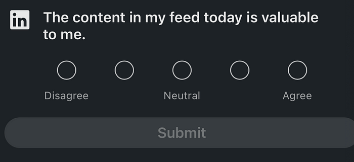
This question was wedged between two posts and was hard to see in dark mode. Compared to regular feed posts, it was slightly outlined in a larger font, with the white LinkedIn logo contrasting against the black.
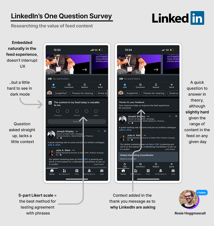
No doubt, this was minimal. In fact, perhaps the team went too far in the lack of context.
Typically, these questions start with a phrase that helps users see this is a question, such as:
To what extent do you agree with the statement
What are your thoughts on…
What do you think of the statement
Or, a direct question:
Are you interested in this content?
Are you a software engineer?
How easy do you find saving files?
With LinkedIn's question, perhaps fewer words are better for them. But I do wonder if some context is missing.
Essentially, one-question surveys should be unambiguous. However, this person had more brainpower from me.
When I read “The content on the feed is valuable,” my internal monologue began:
Well, some of it is valuable.
But not all of it.
It depends on who I see.
Hmm
Then, when I had to choose agree, neutral, or disagree, my thoughts were neither one nor the other. I somewhat agreed, but I would have 100% agreed if the question had been worded:
“Most of the content on the feed is valuable”
or
“I gain value from my LinkedIn feed”
Or, if I could choose “somewhat agree.” Only 3 out of 5 responses were marked, and the fact that “100% agree, 100% disagree” made it harder to choose.
So here are some lessons:
- Make sure people can see your survey (in light and dark mode)
- Ensure the question is direct, in some cases
- Make sure you label options appropriately
Then, you are more likely to get effective product results.
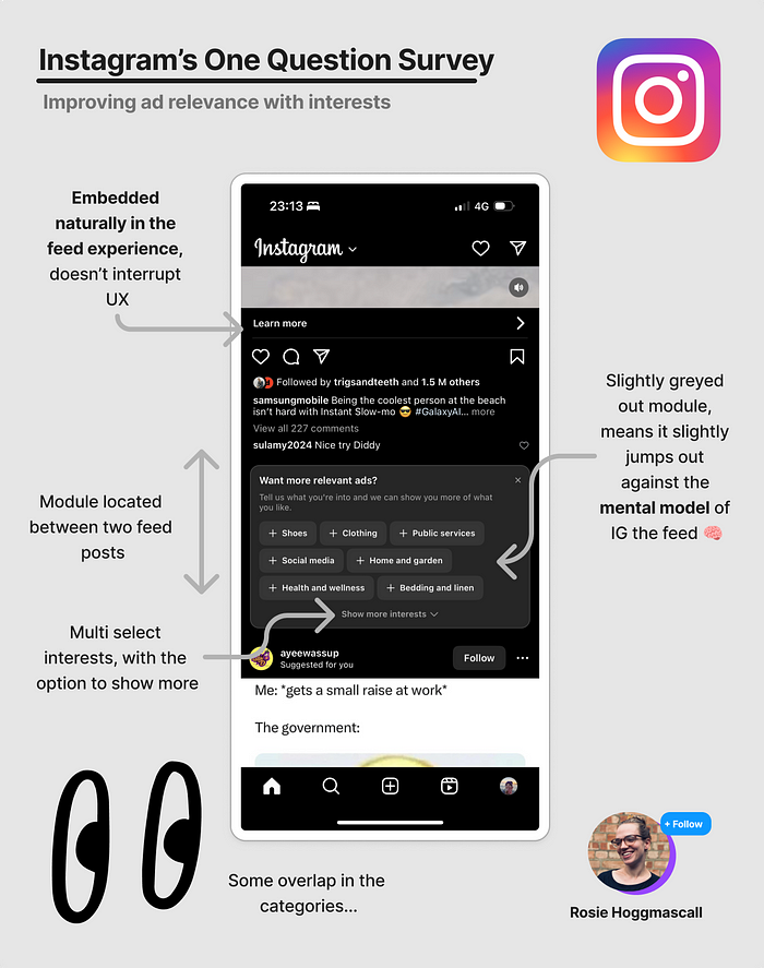
Next, I encountered a personalized question on Instagram.
Instagram's Ad Relevance
Next, in the evening, I was scrolling through Instagram - a bit of escapism.
Wedge between two feed posts - just like LinkedIn - I saw a question in a gray module:
Want more relevant ads?
Tell us what you like, and we can show you more of what you like
Shoes, clothing, public service, social media, home and garden, health and wellness, bedding and linens [show more interests]
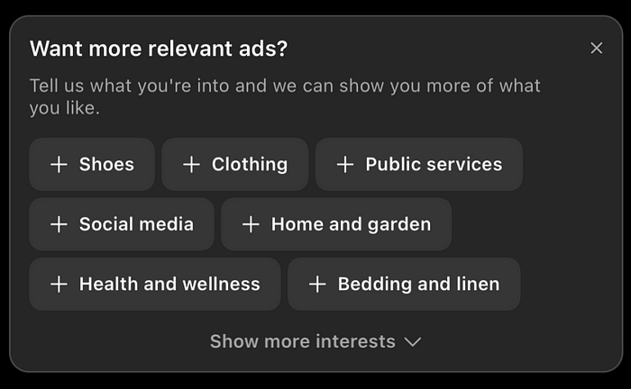
My first thought: what are public service ads? 🥲
My second thought (as a product grower, not as an Instagram user): I wonder if they actually use it to personalize, or if it’s for other research.
Anyway, what I liked here compared to LinkedIn was:
- It was easier to see, the gray module didn’t look like a post, thus breaking the mental model of the feed, perhaps leading to a higher response rate
- Concise: there was enough context to motivate me why
- It was direct: if x is relevant, then the question “want more x” is always effective
What I wasn’t so hot on:
- These categories are so broad that they don’t feel very “me”
- I don’t understand some of them (public service ads…)
- Categories overlap: technically, bedding and linens are part of home and garden.
I would love to see categories positioned as desire categories, such as: “Show me ads that:
- Make me healthier
- Make me more stylish
- Make me wealthier
- Are for my pet
Maybe that would make me choose them. In fact, I ignored this question survey. But not because the categories belong to standard levels, but for one key reason:
I don’t want to buy more things.
Therefore, I won’t help Instagram serve me relevant ads. I also feel that serving me relevant ads is Instagram’s job.
The fact is: I’d rather see fewer ads, save more money, and be happier in consumerism.
Cheers to that 🍻
Trainline's Eco-Friendly Question
Next, a curveball question.
I love these, they are questions you wouldn’t think of.
A few days ago, I booked a ticket to the airport using my favorite train booking app: Trainline. Trainline is a publicly listed company in Europe, with revenue of £327.1 million in 2023, growing by $74 due to net growth in ticket sales.
One of my sales.
So there I was, just having purchased my ticket. As my screen wiped away, I saw a small white module below:
What’s your view?
Trainline actively helps me find the most eco-friendly travel options 🌳
Strongly disagree 1,2,3,4,5 strongly agree
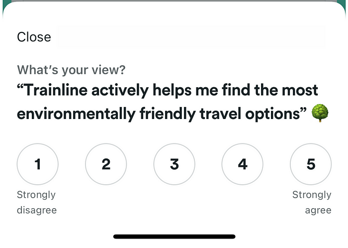
Now, I love this for several reasons:
- It’s very easy to see
- It looks clean
- It’s easy to exit
- It adds context
- It’s easy to answer
So I answered, I put 1.
Strongly disagree.
Why?
Why?
Because there has never been attention to environmentally friendly matters in the UI.
I am curious about this, which is the purpose of the survey. Either:
- Brand survey to understand what they encounter
- They want to try to improve the environment they appear in with a hypothesis test, but want to see the baseline first
- Other (let me know in the comments if you have any ideas)
I also want to thank you for your message. The brand voice is very good:
The best. Feedback. Ever 🙌
Even if your score is 1, you can be like me...
For me, this question is the fastest and easiest to answer among the three examples here. I have no double guessing, no second guessing.
It is also - I think - that this UI leads to the highest response rate. It is more solid, bright, and bold. Compared to the more subtle versions of LinkedIn and Instagram. However, considering the number of users there, I doubt they struggle with response numbers.
In summary, how to run an excellent 1Q survey: Lessons from LinkedIn, Insta, and Trainline
Lesson 1: Make it visible - Don’t hide it in the UI. And make sure to check how it looks in dark mode to ensure accessibility.
Lesson 2: Provide context - Does your response cover all options? Are responses marked? Do people know this question is for them?
Lesson 3: Make questions sensible - Does your answer cover all choices? Are responses marked? Does your question use the language that customers themselves use?
Lesson 4: Sincerely thank - You can add a “why” or just a nice little thank you for people’s time.